PPA 109 Color Challenge Revealed
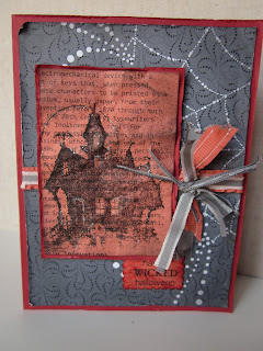
Hello there! Today's PPA Challenge is a color challenge using Calypso Coral, Riding Hood Red, and Basic Gray. It definitely stumped me for a minute, but I went to my huge stash of SU Halloween DSP and pulled out a piece with some basic gray. Here is what I came up with:
So, do you like my First Edition DSP? It comes in very vanilla and basic black. So how did I get it in Calypso Coral you ask? I used a brayer! I inked up the brayer in calypso coral and brayered the ink on. It takes just a few coats to get it as dark as you like, then let it dry a bit.
I spritzed black and gray with the color spritzer, and sponged basic black on the edges. I held my breath and crumpled it all up, and distressed the edges. Yes, I like how it turned out, but it is a little nerve wracking when you crumble up a perfectly good image. You can just barely see it, but the image was outlined using a brand new product Dazzling Details, think liquid Dazzling Diamonds! It comes out on today, on September 1st.
I wanted some ribbon, but wanted it distressed, so I layered the new ruffled ribbon in calypso coral with some basic gray taffeta ribbon that I cut the ends off and frayed. I then made a messy knot of bits of scraps of both ribbons, for a nice distressed look.
The whole card, inside and outside was distressed, and let me tell you, it is liberating! It doesn't matter if you get a smudge, or if your image doesn't turn out perfect, that is the look! So go ahead and try it yourself. It is down right fun. Crumple, scrunch, smudge, try the direct to paper ink technique, it all works, just have fun.
Thanks for those of you who tried to guess the challenge, and my announcement. You guys are getting creative, I like that. So without further adieu, here is my big announcement!!
I have been chosen to be a Guest Designer on The Paper Players Challenge blog! Click HERE to go to The Paper Players site. I am super excited to get to showcase my work on such a wonderful site. The Design Team has some very creative heavy hitters, and I am so honored to be a part of such a talented group of stampers. Look for my very first guest designer submission on Sunday, I hope to see you then, enjoy!
Stamps: Wicked Cool, House of Haunts
Paper: SU retired Halloween DSP, riding hood red, calypso coral
Ink: Basic black ink and stampin write marker, basic gray stampin write marker
tools: Postage stamp punch, basic gray taffeta ribbon, calypso coral ruffled ribbon, bone folder, dazzling details


Comments
Hugs, M